Wednesday, February 20, 2013

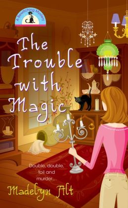
The Trouble with Magic


The Trouble with Magic
By Madelyn Alt

3 Covers out of 5

This first book in the Bewitching Mystery series begins with Maggie O’Neill, lifetime resident of Stony Mills, Indiana (population 6,000+), literally stumbling into a new job at the gift shop Enchantments just in time for the owner and sole other employee, Felicity, to be accused of murdering her sister.  Sadly, these sorts of coincidences abound as Maggie endeavors to solve the crime while battling the police dept.’s prejudice towards Felicity as a self-proclaimed New Age witch.  The mystery itself is rote, with red herrings barely registering against the obvious culprit.  But the story is enhanced through the use of the supernatural, even though it has absolutely no bearing on the case.

The author does a good job establishing the small town setting, showing it to have a diverse culture as a growing suburb, even though there is an element of the Catholic majority being closed-minded.  But the author has also perhaps read too many mystery novels as the story treads a well-established trail, though sometimes using lazy shortcuts to achieve her ends.  A particular stand out of this is the scene where Maggie informs the reader (the story is told in first person) that people have always felt they could confide in her, just in time for someone to confide a large amount of exposition that probably could not have fit in neatly any other way.  Of course, in the same scene Maggie declares that she is a good judge of character, despite the reader having already seen her misjudge two characters already.

Part of the problem is Maggie herself.  She is not a dynamic character, spending much of the story reacting rather than acting.  And quirks that are supposed to be endearing come off more as pathetic, such as her obsession with the television show Magnum PI, which somehow does not extend to owning the DVDS.  The story does pick up in the last third when she begins to actively solve the case, even if she doesn’t act within the full level of her intelligence.

Now, as I have pointed out what I see to be several flaws in the storytelling, it may seem like I should give the book a lower score.  While the mystery itself is average, I come back to the supernatural element which sets the story apart from other mysteries, especially the hint that there is something sinister going on in Stony Mills to be dealt with in future books.  I wish the supernatural had been more key to the mystery itself, but I will take what I can get.   

Thursday, February 7, 2013

The Pluto Files


The Pluto Files: The Rise and Fall of America’s Favorite Planet
By Neil deGrasse Tyson

3 ½ Covers out of Five

The Pluto Files is a very interesting look at the scientific and cultural history of the former planet.  It is easy to see why Neil deGrasse Tyson is an ambassador of science who can make astronomy cool through numerous appearances on The Daily Show or helping to locate Superman’s home planet of Krypton.  He has a very easy going style that allows him to explain all the scientific facts without being bogged down by it.  The fact the he has such a topic as Pluto also helps accessibility.

Tyson traces the rise and fall of Pluto as a planet and the surrounding controversy of his downgrade to a dwarf planet.  But he pays particular attention to why Pluto is so beloved by Americans, so much so that New Mexico has declared Pluto to still be a planet.  These sorts of tidbits and cultural history make it so 
there is something for everyone in the book.

Where I found Tyson falter is when he gives himself a key role in the controversy.  Not to say that he didn’t have a role, but the lack of objectivity strains the credulity of his arguments.  And while covering the breadth of the topic, the author doesn’t reach the depths that are possible.

Nevertheless, The Pluto Files is fun and informative (“chock full of edutainment,” as the cover of one issue of the comic book Bone would have put it).  And as a way to get someone interested in astronomy, it does its job.

Wednesday, February 6, 2013

The City of Ember: The Graphic Novel


The City of Ember: The Graphic Novel
By Jeanne DuPrau
Adapted by Dallas Middaugh
Art by Niklas Asker

2 Out of Five Covers

In the interest of full disclosure, I have not read the book The City of Ember.  I did see the movie that came out a few years ago, which was entertaining but not great.  Sadly, this graphic novel is a step down from that.  The story takes place in the titular city of Ember, an underground city where the remnants of mankind have lived for over two hundred years after some great calamity.   But the city was only supposed to last two hundred years and now it is breaking down, with power outages and food shortages.  Doon and Lina enter the city city’s workforce with the goal of trying to fix what has gone wrong but instead discover the city’s greatest secret: that they were meant to leave.

The story has the potential to be engaging, with the reader puzzling out the clues alongside Doon and Lina.  And the author included many elements to make the characters well rounded and their story about more than just one mystery.  It just doesn’t translate to the graphic novel.

For starters, the character designs for Doon and Lina are too similar.  About the only thing that tells them apart is the hair style.  The heavy use of brown and yellow is overwhelming.  Yes, an underground city would be dark, but all the muted colors becomes ponderous.   And (spoiler alert) even after they reach the surface, everything is still in brown and yellow tones.

Lest you think it is only the art that I found uninspired, the adapter is fully complicit with the illustrator.  Many of the world-building elements that are important in portraying the plight of the city are glossed over in favor of the main storyline.  And in the main storyline, everything seems to be resolved a little too easily for Doon and Lina.  This is especially evident in one sequence where, after the pair have been declared criminals, Lina goes back for her infant sister and then just shows up with the child the next page; no explanation of how she accomplished this. 

I was very disappointed with this graphic novel and worse, it does not make me want to go read the book.

Tuesday, February 5, 2013

A Wrinkle in Time: The Graphic Novel


Madeleine L’Engle’s A Wrinkle in Time: The Graphic Novel
Adapted and Illustrated by Hope Larson

4 ½ Out of 5 Covers

For the fiftieth anniversary of Madelein L’Engle’s Newberry Award novel A Wrinkle in Time, this wonderful graphic novel adaptation was produced.  The story follows Meg Murry who, with the help of her brother Charles Wallace and friend Calvin, help Mrs. Which, Mrs. Who and Mrs. Whatsit in their battle across space with the gathering darkness, represented by IT.  L’Engle mixed in a little bit of everything in this tale: science fiction, fantasy, mystery, etc., along with a hefty dose of social commentary.  The story would have been unique fifty years ago and has stood the test of time because of the basic truths its portrays.

It is the sort of story that can greatly benefit from visuals, which Hope Larson masterfully brings to life in this adaptation.  Larson’s style can be described as cartoony and in this work she uses a limited color pallet of black, white and blue.  It can be argued that creating these illustrations takes away from the reader’s imagination, and that may be true for the occasional panel, but for this adaptation it is a strength.  The style makes it much easier for the reader to project and empathize with the characters (what Scott McCloud termed “amplification through simplification”).  Larson gives each character a unique appearance so they are easily distinguishable and also makes sure their posture and movements reflect their emotions.  And since there are some strange descriptions in the novel, these illustrations help the imagination rather than limit it.

And the production values are amazing.  It is noticeable different from other graphic novels.  This is meant to feel like a book with its size and high quality pages.  And the publisher wisely gave Larson as much space as she needed to tell the story. 

My one complaint is that a little splash of color could have gone a long way to dramatizing certain portions.  I think particularly of the chapter “The Man with the Red Eyes,” where giving the man red eyes would have been appropriate and really highlight his danger in contrast with the rest of the coloring.

This was one of the best graphic novels I read last year.  I cannot recommend it enough.

Saturday, February 2, 2013

The Unwritten Vol. 6


The Unwritten Vol. 6: Tommy Taylor and the War of Words
By Mike Carey, Peter Gross and M.K. Perker

4 Covers out of 5

The Unwritten is a brilliant comic book series that explores the meaning and role of stories in society.  The saga follows Tommy Taylor, the son of author Wilson Taylor and namesake of the boy wizard in the most popular book series in the world (yes, the parallels to another book series are meant to be obvious).   But is Tommy really the son of Wilson or is he the boy wizard come to life?  This question is at the core of Tommy’s battle with the Unwritten, a secret cabal that uses stories to manipulate and control the world without ever being written about.  That battle comes to a head in this volume, where Tommy heads an assault on the enemy headquarters and confronts and learns the secret history of his nemesis, Mr. Pullman.

The volume alternates between that main storyline and issues that explore the histories of various characters.  And since this is a story about stories, that history goes back to the origin of man.  That the creators have been able to weave together such an epic mythology is amazing.  And the idea that stories are a kind of magic and can create reality is a powerful and compelling one for any reader.  But it is also a very metaphysical idea that is hard to explain.  This is where the use of illustrations comes to the forefront.  The ability to visualize this idea helps to ground it in the readers mind.  But it is still hard to have a firm hold on it and there are moments where it seems like even the creators reach exceeds their grasp. 

The other problem I had was that this volume very much completes the story that began in the first volume, yet the series is going to continue on.  It may seem odd to complain that I’m going to get more of a good thing, but I didn’t get any sense of how the story would carry on.  It really feels like there a just a few loose ends that can be tied up very quickly, yet the series has over twenty more issues prepared with no conclusion in sight.  I have since found out where the storyline is going and it does make sense and I am especially looking forward to The Unwritten crossing over into another excellent series, Fables.   My issue is that it didn’t feel like many of those future stories were set up here.

I would be remiss if I didn't mention the wonderful covers by Yuko Shimizu.  The style is very different from the typical comic book covers and that gives the series an aura of art, that this is going to be better than the average comic book.  
For all my quibbles, The Unwritten is an excellent read and considering that Vol. 6 has ten issues for $17.99, Tommy Taylor and the War of Words is a bargain as well.